The Mystical Archive cards are really pretty cool. They’re not like Secret Lair cards, and that’s a good thing. These bonus cards are exactly the type of bonus that Magic needs to include in their regular packs as often as possible. These cards are nowhere near as rare as the inventions from Kaladesh or those pretty cool Expeditions we’ve seen twice over now. They are even more plentiful than the most recent “bonus slot” that we saw with the time shifted cards in Time Spiral Remastered. The frequency at which Mystical Archive cards appear is honestly a boon to most players. I don’t foresee these becoming super collectible, as the supply should be super high on these things. Cassie, on Cassie’s Calls for TCG player, had a great take on these cards, and I agree with her as for their future projected values. I’m more excited to discuss the aesthetic effect these cards create.
Let’s go back a few months to when Commander Legends came out. Opening packs of Commander Legends was just awesome. As a Commander/EDH player I just love seeing legendary creatures in my packs. I love seeing big flashy spells. When flashy spells, multiple legendary creatures, and bonus rares show up in my packs, well, I’m over the moon about it. I just feel like I’m getting more for my money. The playable value of commons and uncommons for my Commander/EDH collection just continues to grow. Avoiding chaff and bolstering my ability to build multiple decks from pack cracking is where I want to be whenever I’m peeling foil wrappers off packs. I love buying singles, but the rush of cracking a pack—well, you know. Everyone loves that fresh ink smell. I wrote about the playable value that Commander Legends had, and that is similar to what we find in Strixhaven. There’s some solid value at the rare and uncommon range for Commander players, and there are a few commons that come to mind as being potential staples for deck building. So, cracking some packs and walking away with usable cards is pretty likely. The commons and uncommons don’t overwhelmingly seem to be great fits for varieties of Commander/EDH archetypes. This is no Commander Legends 2 (it is a Standard set after all), but it is still a pretty solid set for the Commander community. We can look forward to getting a decent number of legendary creatures and several worthwhile spells for all levels of competitiveness.
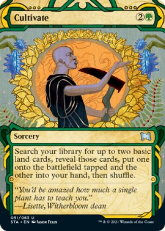
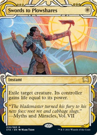
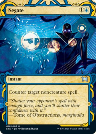
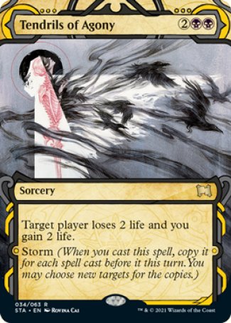
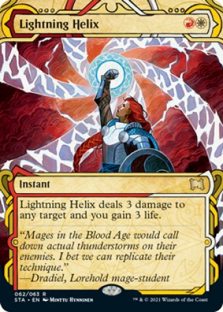
Even more than the playable value or legendary as-fan (how often a legendary card appears in a pack), the variety of art is what I’m most excited by in these Strixhaven packs. Too often I find myself a bit bored with the homogenized art style in Magic’s recent sets. Now, I’m not at all trying to say that the artwork isn’t excellent. It is. The art is great, the artists are fantastically talented, and aside from the random cards by a few of the older artists with unique styles (Rebecca Guay comes to mind, obviously) the art is very similar. I guess my gripe might be aimed more adequately at Magic’s art director? I’m honestly unsure. Yet, I am a lot less “gripe-y” about having these unique looking cards in every pack. They really serve to break up the art style. I mean, sure, Seb McKinnon and a few others have styles that differ a bit, but it really isn’t like it was back in the 90’s. I’m not saying that the 90’s was perfect, or anything near perfect to be totally honest. Yet, the art had a variety about it. When you opened packs of cards the artwork wasn’t super similar. The Mystical Archive provides artistic variety similarly to those great comic book showcase treatments that Ikoria did. Ikoria did a lot of things right for a set released when a lot of things were going wrong the whole world over. It provided people with many of their favorite non-Magic IP property treatments (the Godzilla-skinned cards) and it utilized showcase treatments to provide a unique art style within the context of its overall world. The Mystical Archive fills this gap in a unique way.
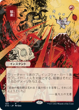
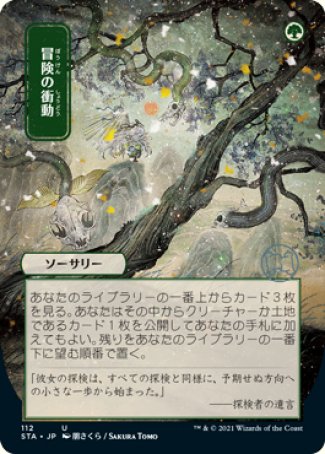
Lightning Bolt - Ezoi Adventurous Impulse- Sakura Tomo
Over the years, it seems like there’s a push to ensure that we feel the cards and characters are all from the same world. Yet, does that mean they all need to be styled alike? I wouldn’t think so, but if you look at Magic’s art direction it clearly seems to point in exactly that direction. Making all your creatures of a certain type look similar in a given world helps lend it consistency. The horned elves of Lorwyn or the Merfolk of Ixalan seem to be solid examples of that style of art direction. The crystalline themes throughout the Ikoria set also brought this home. Yet, I’m not convinced the entire art style needs to be adopted in order to sell us that story. Those Ikoria cards with the showcase treatments still incorporated crystals and feel of the plane, but managed to provide a variety of artistic treatments that were stylistically unique. It seems that in selling us a story we’ve lost that fine art feel that Magic could once give you. You could open packs where artworks were wildly different, and you could debate with your friends about which artist had the best style. I’m not sure this debate can even exist as it once did. Today’s art is all so hyper realistic—which is fine when it’s a few artists styles, but becomes a bit repetitive when it’s all we see. I don’t want to sound like I’m being negative. I love Magic, and I love Magic card art. I enjoy the modern hyper realistic art style, but I also miss cards that were after Quintin Hoover’s comic book style. I miss the artistic variety that could once be found in a normal pack of cards. Strixhaven’s Mystical Archive cards bring that back. They do it in a way that’s very similar to Ikoria’s showcase treatments. However, they do it all while combining people’s requests for reprints. It’s the beauty of “the list” reprints and showcase treatments combined.
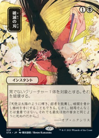
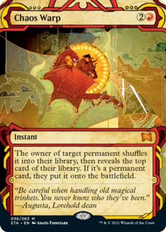
Doom blade - Rindo Karasuba
I guess that’s another reason I loved these Mystical Archive cards. You could get totally different vibes from a variety of creatures or spells, and still believe that it was all the same “world” or “plane” without issue. Using this lithographic or manuscript style and making the cards have their own feel and way of existing in the world of Strixhaven is really a stroke of genius (why wasn’t that in the mystical archive… hmm). I mean, they must’ve untapped their Tolarian Academy and had a real turnabout in order to come to the conclusion that providing reprints, utilizing showcase treatments, and still tying it all back to the current set’s plane is just phenomenal. Really, when I step back and think about how that all works together I’m so pleasantly pleased by it all that I’m shocked it didn’t happen earlier. Whoever had this brainchild deserves some serious KUDOS! When you look at the evolution of cards and treatments from Ikoria through now the evolutionary line seems pretty clear. I’m even accounting for the “out of planned order” release of sets. This progressive build to making reprints highly available in each pack while still linking them with the plane and yet creating visually unique versions is awesome. In short, Mystical Archive cards get everything right. I know that not everyone will like the border treatments or even the art style. That’s not the point. The point is that we can have cards that buck the current trends, create unique takes, and still work within the greater framework of the game. This is wonderfully positive news. These spells of the past bring unprecedented hope for the future of Magic: the Gathering.
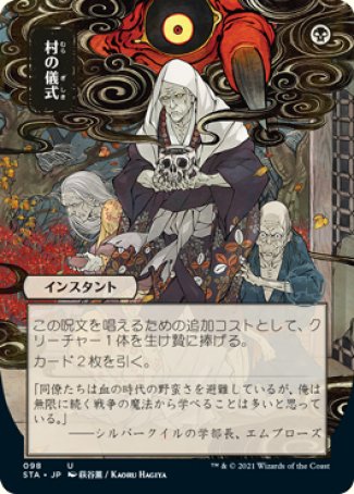
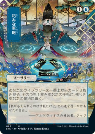
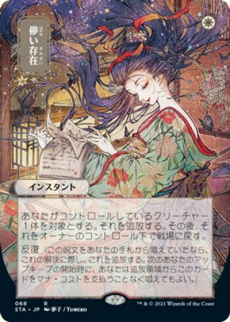
Village Rites - Kaoru Hagiya Strategic Planning - Hatori Kyoka Ephemerate - Yumiko
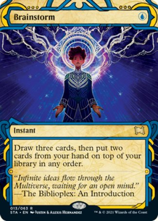
It is going to be very cool when we get a chance to reflect back on this set and see what it helped lead to in the next ten year or so. These series of advancements in art variety, reprint accessibility, and story inclusion are promising indeed. Being able to discuss and talk about this is really cool. I hope that we are in an even better space a year from now, and are free to discuss this at our tables together while shuffling and debating who has the best Brainstorm art in their 99.


